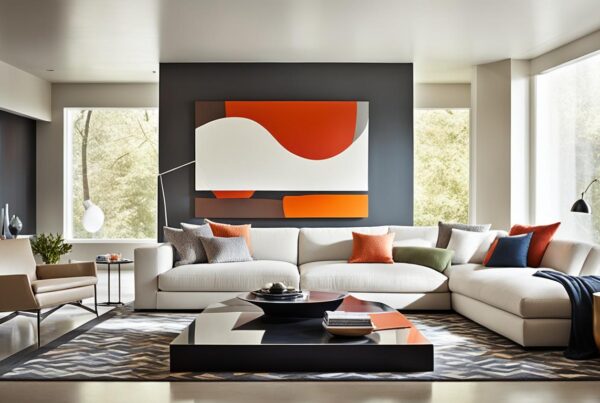
Do you love the idea of an open floor plan? The way it flows, brings people together, and lets in so much light is amazing. But, painting these spaces can be tough. I run Pro Painters in Salt Lake City and I know how the perfect cohesive color scheme can change everything. With a professional painting project, you’re not just adding color. You’re carefully choosing a palette that makes your space special. I’m here to help connect different areas smoothly, making your open floor plan come alive.

Key Takeaways
- Embrace the complexity of open floor plans by harnessing the transformative power of paint.
- Select a color palette that unites separate areas while celebrating the openness of your space.
- Leverage professional insight to achieve balance and an aesthetically pleasing flow.
- Understand that the right colors can define and enhance the functionality of your interior.
- Trust in the potential of a professionally executed painting project to elevate your open-concept design.
Understanding the Dynamics of Open Floor Plans
Exploring open floor plan challenges shows opportunities and complexities. At Pro Painters, we use open-concept design to improve interior space functionality and looks. This design helps with easy flow and makes spaces great for fun or quiet times.
An open floor plan makes homes feel bigger and welcoming. Yet, it can lead to noise, less privacy, and messiness. We use colors and furniture smartly to solve these problems. Different paint colors can mark areas without needing walls.
| Challenge | Strategies |
|---|---|
| Noise and Privacy | Use furniture placement and area rugs to create ‘pseudo walls’ or quieter zones. |
| Clutter Control | Opt for built-in storage solutions and multi-functional furniture. |
| Space Definition | Apply varying paint colors and lighting to designate different functional areas. |
With open-concept design, balancing open areas and private spots is key. At Pro Painters, we’ve seen open floor plans meet client needs and change how they use spaces.
Creating a Cohesive Color Palette: Beyond Primary Colors
When we talk about designing with an open floor plan, using a cohesive color palette is key. It’s more than just picking colors you like. It involves a careful selection of three to five colors that work well together. For example, choosing blue, blue-green, and green can create a unified yet diverse space.
It’s important to understand the color wheel theory for balance. It’s not only for looks but also to make the space work better. Using colors next to each other on the color wheel brings a pleasing and unified view. This method allows for variation while keeping each area connected yet unique.
- Analogous color schemes enhance unity
- Subtle differences in saturation and lightness can define separate areas
- The right color temperatures can influence mood and perceptions of space
Putting this color plan into action is crucial for a cohesive look. Let’s see how I apply these ideas in real-life settings:
| Color | Color Wheel Position | Area of Use |
|---|---|---|
| Blue | Cool/Adjacent to Blue-Green | Main Living Area |
| Blue-Green | Cool/Between Blue and Green | Transition Space |
| Green | Cool/Adjacent to Blue-Green | Kitchen |
I choose each color for its look and how it meets the space’s needs. This unity creates a smooth flow throughout, based on color wheel theory.
Interior Painting: Selecting the Right Shades for Openness
When choosing colors for open spaces, the 60-30-10 rule is key. It makes sure everything feels connected and spacious. This rule helps keep the color flow smooth across the space.
We use 60% of our main color to set the room’s tone. It should match the room’s light and design. Then, we add a secondary color for 30% of the space. It adds depth but still matches the main color. The last 10% is an accent color for a fun visual spark.
With the right colors, your space smoothly moves from one area to another. It feels like one large room even without walls.
Using colors from the same family, like blues and greens, brings everything together. It lets each area stand out without losing harmony. This approach makes transitions smooth but intentional.
Here’s a quick guide on using the 60-30-10 rule for openness:
| Color Type | Percentage | Color Examples |
|---|---|---|
| Dominant Color | 60% | Soft Blue, Light Gray |
| Secondary Color | 30% | Aqua, Medium Gray |
| Accent Color | 10% | Navy Blue, Charcoal |
This color plan makes every area work well together. It’s all about placing each color just right. Every shade and tone has a role, making spaces look and feel good. This way, we create rooms that are nice to be in and look great.
Strategic Use of Color to Define Your Space without Walls
As part of Pro Painters, I’ve learned how zoning with color and painting strategies can change open spaces. Using colors smartly lets us make different areas in one big space. We don’t need walls to do this.
Picking the right colors and their placement is key. For example, we can separate the dining area from the living room. We use different shades of the same color. This makes a smooth look but still marks each area.
Trims can also help tie different wall colors together. They keep the look unified while marking different spaces. Below is a table showing a good color scheme for open spaces. It uses shades to mark different areas well.
| Zone | Main Color | Trim Color | Accent Color |
|---|---|---|---|
| Living Area | Soft Beige | White | Ocean Blue |
| Dining Area | Warm Gray | White | Burgundy |
| Kitchen | Pale Green | White | Lemon Yellow |
This table shows how to clearly mark different areas in one space. It uses contrasting but matching colors. This makes each part clear and makes the whole area look better.
Using colors with thought can shape how spaces feel and are used. This makes sure every part of an open floor plan works well and looks good.
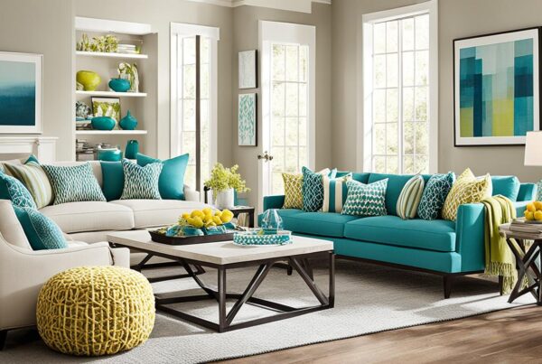
Incorporating Neutrals and Accents: Creating Interest without Clutter
I love making spaces look and feel great. Using neutral color palette in open areas works best. It makes a place calm and inviting for everyone. Then, adding colorful accents like Fireweed or Silken Peacock brings life. These colors add fun and style but keep things clutter-free.
- Strategic Placement: Use bright accents in just a few places. Put them where they catch the eye, like a kitchen island or bookshelves. This avoids too much going on.
- Balance with Neutrals: In mostly neutral spaces, a bit of color really pops. It draws attention and makes the space interesting without being too much.
- Harmony and Contrast: The goal is to make bright colors fit right in. They should add excitement but still match the room’s overall vibe.
At Pro Painters, we know when and where to add these eye-catching elements. They can highlight special parts of a home or add flair to useful places. Our goal is to make homes look amazing. We aim for beauty without clutter.
Building a Focal Point: The Art of Attraction in Open Layouts
The art of making focal points is key in open layouts. As a painter, I use these areas to bring rooms together. They add personality and style. This helps control where people look and sets the mood for the space.
The kitchen island can be the home’s focus. Make it stand out with a bold color. This turns it into more than a work spot. It becomes a main attraction. Adding texture to walls brings depth and style, making the space more inviting.
Choosing painting focal areas in open spaces involves:
- Assess the flow of natural light: See how light moves. This helps highlight important spots and where to place focal points.
- Consider foot traffic: Busy areas are great for focal points. They catch more attention.
- Use architectural features: Use existing elements. Fireplaces and unique walls guide where to focus your design.
| Feature | Type of Treatment | Expected Impact |
|---|---|---|
| Kitchen Island | High-gloss, vibrant color | Creates a lively social hub |
| Statement Wall | Texturing with mixed media | Adds depth and artistic flair |
| Fireplace | Subtle matte or satin finish | Enhances warmth and coziness |
In summary, creating focal points does more than just paint. It’s about smart design choices that boost both function and beauty in open layouts. By carefully designing and painting focal areas, we create visual appeal. And we bring order and beauty to large spaces.
Conclusion
The transforming power of professional interior painting goes beyond looks. It shapes how spaces work and feel. At Pro Painters, we see our job as more than just painting walls. We aim to create an atmosphere that shines with balanced design and practical beauty. Our mission is to match the client’s dream with the perfect color and accents.
We combine painting skills with a personal touch. This helps us face the challenges of open spaces head-on. By doing so, we create focal points that not only catch the eye but also tell a story. It’s not just about putting paint on walls. It’s about creating an experience that brings together style and function.
At the end of the day, the success we see comes from mixing our clients’ ideas with our expertise. My team at Pro Painters is dedicated to achieving painting perfection. Every stroke we make is aimed at delivering custom, practical art. Our work turns the ordinary into something special, making sure clients love their open spaces for years.
FAQ
What are some challenges of painting an open floor plan?
When painting an open floor plan, it’s tough to make sure everything looks connected. You need to pick colors that help different areas stand out. Yet, everything still needs to look good together for the space to work well.
How can I create a cohesive color palette for my open-concept design?
To make a cohesive color palette, choose three to five colors that look nice together. These can be colors that are close to each other on the color wheel. Knowing about colors helps you pick ones that make the space feel united.
What is the 60-30-10 decorating rule and how can it be applied to an open floor plan?
The 60-30-10 rule splits colors in a room into percentages to create balance. Use 60% as your main color, 30% as your secondary color, and 10% for an accent. This keeps an open floor plan feeling open and balanced.
Can using color help in defining spaces in an open floor plan?
Yes, color is great for marking different areas without walls. Keep the wall color the same where walls run together. Then, use different shades to mark different places or features. This makes clear zones in the space.
Should I only use neutral colors for my open floor plan space?
Neutrals are easy to match, but adding bright colors can make the space unique. Bright colors, like Fireweed or Silken Peacock, can spotlight features or areas. They add fun without making things feel crowded.
How do I establish a focal point in an open floor layout?
To make a focal point, try painting a kitchen island a bold color or use texture on a wall. This catches the eye and breaks up the space nicely. It makes the design feel more grounded.
Why is it beneficial to hire professionals like Pro Painters for an open floor plan painting project?
Professional painters like Pro Painters know how to make an open floor plan work. They’re good at choosing colors and defining spaces. They make sure your space looks great and works well.