As a fan of interior painting and home decor, I’ve found a special way to mix paint and wallpaper design. This mix can change a room and make it stand out. It adds depth and personality, making your space truly yours.
Wallpaper has cool patterns that paint can highlight. Choosing the right paint colors can make these designs pop even more. This blend of paint and wallpaper gives any room a fresh, stylish look that’s hard to resist.
Key Takeaways
- Paint and wallpaper combinations can transform a space into an exceptional visual experience.
- Selecting the right paint color enhances the intricate patterns of wallpaper, adding depth to home decor.
- Painting the ceiling in a complementary tone can unify a room’s interior painting scheme.
- Embracing vibrant or neutral colors helps achieve a unique style that reflects personal tastes.
- The blend of wallpaper and paint techniques offers a refreshed and stylish ambiance.
Understanding the Basics of Interior Painting and Wallpaper Integration
Exploring home design is exciting. A great paint and wallpaper combination really makes a room pop. As a painter, I’ve found success in matching paint colors with wallpaper shades.
Rather than just a white ceiling, adding vibrant or deep colors can link back to the wallpaper. This creates a connected and warmer feeling in any room.
Choosing paint that extends the wallpaper’s design leads to a custom look. This way, paint and wallpaper join to form a classy decor technique.
Here are some pairs that have turned rooms into stunning spots of color and design harmony:
- A room with green and brown nature wallpaper pops with a sage green ceiling. It feels more natural.
- Monochrome geometric wallpaper goes well with bold charcoal paint for a modern effect.
- Pairing soft pastel wallpapers with light ceiling colors like sky blue opens up a room.
With these decor techniques, any space can showcase an amazing paint and wallpaper combination. It’s a way to show off your style and beautify your home design.
Transforming Ceilings with Complementary Paint Shades
I have learned a lot about interior design. The ceiling, or ‘fifth wall’, really shapes a room’s look and feel. I like using ceiling paint ideas that go well with the wallpaper. This makes the room look better together.
Using complementary colors on the ceiling is smart. It makes the room feel more together and lively. For example, I used a dusky Dorchester Pink ceiling with Bird & Bluebell – Pea Green wallpaper. This made the home office peaceful yet stylish.
In bedrooms, where feeling cozy is key, dark, rich colors make it a nice retreat. I matched Puck on the ceiling with subtle two-tone wallpaper. This wallpaper enhancement made the room elegant and calm. It also made the design feel complete and polished.
The main goal is to make a space that’s not just nice to look at but feels right. Good ceiling paint, that goes with the wallpaper, can change a room. It makes the space feel special and fits the home’s overall look.
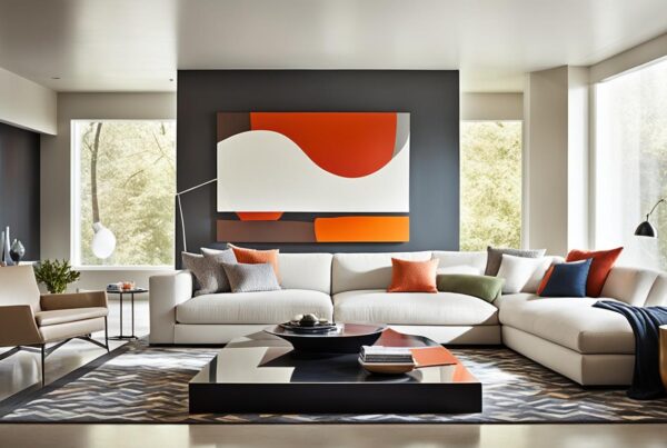
Injecting Personality with Vibrant Coordinating Colors
As an interior style fan, I love using vibrant color schemes. They make rooms lively and inviting. For instance, a bright mural like Upper Brook St – Soleil can change a dining area. It matches well with colors on door trims and woodwork, creating a stunning look.
Using coordinated colors makes spaces stand out and flow better. Take the mix of Poppy Trail – Masquerade on walls and Yellow-Pink on paneling. It makes spaces feel connected yet distinct. Guest bathrooms shine with these choices, leaving an unforgettable vibe.
- Vibrant color schemes make rooms exciting and visually impressive.
- Coordinated colors offer a cohesive, welcoming look for everyone to enjoy.
- Big murals and contrasting paints bring out each area’s special features.
Adding vibrant colors does more than beautify. It makes places warm and welcoming. This touch transforms any house into a home.
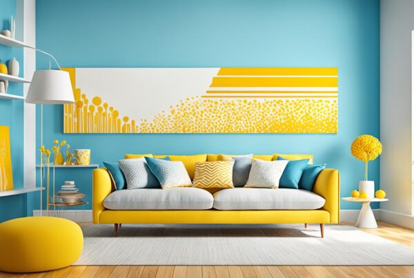
Creating Impact with Color Drenching Techniques
In my work, I’ve used a powerful method called color drenching design. This means picking one color and using it throughout a room. It makes the interior feel cohesive. Adding chosen wallpaper with this makes the room not only unified but deeply characterful.
For instance, in a living room, I used the Briar Rose wallpaper. It’s luxurious and textured. I combined it with Mid Azure Green paint on the ceiling and woodwork. The result? A cozy, inviting space.
In a dining room, I used Hoja wallpaper in Air Force Blue. Then, I added bold colors on the furniture and woodwork. This mix created a modern, striking dining area. It shows how color makes rooms impactful and unified.
Color drenching brings everything in a room together. It lets me show my creativity. And it helps clients see their space’s full potential. Making homes visually stunning and welcoming.
Enhancing Focal Points Using Sophisticated Neutrals
Using a sophisticated neutral palette makes a room with special wallpaper feel elegant. Instead of bright whites, picking shades like soft greys and creamy whites helps. These colors give the walls a soft finish. They make the wallpaper’s details stand out more.
Imagine a room where coordinated wallpaper and paint matter a lot. A wallpaper called Volières – French Grey can change a space. When you pair it with matching French Grey on the panels, you get a classy look. The wallpaper called Dahlia Scroll – Giallo, with Silent White around it, looks calm and refined. These examples show how matching colors create a nice setting.
This design trick is not just about looks but also feeling. It makes spaces feel big yet cozy. A sophisticated neutral palette shows that great style is in the small details. These choices make the home not only beautiful but also a lovely place to be.
Harmonizing wallpaper and paint not only enhances the aesthetic but also the experience of the space, nurturing a home that feels both expansive and intimate.
- French Grey wallpaper with matching French Grey shades on panelling elevates unity.
- Dahlia Scroll – Giallo wallpaper with Silent White creates a soothing and sophisticated environment.
Choosing a sophisticated neutral palette makes a home look and feel elegant and peaceful. This is where interior design shines. It gives a home its special vibe and charm.
Curating Harmony with Tone-on-Tone Wallpaper Selections
As a designer, I believe that a key to a harmonious decor is choosing the right tone-on-tone wallpaper. This approach helps create a cohesive home interior. It makes each room blend well with the others. Tone-on-tone designs also make spaces look bigger and more connected.
One method I love is to mix and match wallpaper patterns. I keep the colors the same but change the designs a bit. This adds depth and interest without being too much.
“By using similar hues across different rooms, I ensure a continuous and inviting atmosphere throughout the home.” – Personal experience in interior design
The effect of this strategy is clear in rooms where I use wallpapers like Emrik Misty Blue and Ragnvi Indigo Blue. These choices not only go well together. They also make the living area look better.
Here’s how I match tones in different rooms to improve the visual flow:
- Living Room: Soft, muted blues with subtle patterns
- Dining Area: Slightly darker shades of blue with a textured finish
- Bedroom: Lighter tones to create a soothing, restful space
- Hallway: A blend of the two, providing a transition that feels both natural and cohesive
This tone-on-tone method is more than just looks. It’s about making a living space feel connected and intentional. Using the same color throughout brings peace and calm to a home. It makes the home not just pretty but also emotionally soothing.
Conclusion
Turning a house into a home is a creative journey. As the lead at Pro Painters in Salt Lake City, I love helping with this. Using wallpaper and paint together makes a home special. It mixes elegance and personality. A good mix makes any room stand out. It changes it into a personalized space that tells your story.
There are many ways to use sophisticated neutrals and color drenching techniques. These methods bring out the best in wallpaper designs. They make a room look unified. With custom interior design, the options are endless. Paint and wallpaper together let you show your style. They make your home stylish, cozy, and in harmony.
The idea of matching tones brings the whole home together. It makes moving from one room to another smooth. Mixing wallpaper and paint is not just about changing a space. It’s about creating a unique home. I’m here to help bring your home ideas to life. Every brush stroke and wallpaper panel adds to your home’s beauty.
FAQ
How do I choose the right paint to complement my wallpaper design for a unique style?
When picking paint for your wallpaper, consider the colors it features. Find a paint shade that matches well or contrasts nicely. This will create a harmonious, unique look in your decor.
Can you combine different styles of paint and wallpaper to create a cohesive room design?
Yes, you can mix paint and wallpaper styles to add depth to your design. Make sure they share common colors or looks. This keeps your room’s appearance unified.
What are some ceiling paint ideas that complement wallpaper?
Choose ceiling paint shades found in your wallpaper. Putting wallpaper hues on the ceiling brings the room’s design together. It also enhances your wallpaper choice.
How can I use vibrant coordinating colors to express my personal interior style?
Pick vibrant colors that go well with your wallpaper. They should match or nicely contrast without clashing. This makes your decor express your style and feel welcoming.
What is color drenching, and how can it create a characterful space?
Color drenching uses one color on many surfaces in a room for a bold look. Adding striking wallpaper adds character and drama within this space.
Can sophisticated neutrals be used effectively with wallpaper to create an elegant home style?
Yes, neutrals can make a wallpapered room look elegant. Pair them with coordinated wallpaper for a soft yet sophisticated finish.
How do tone-on-tone wallpaper selections contribute to a harmonious home decor?
Tone-on-tone wallpapers use varying shades or patterns in the same color family. This approach makes your home look unified and pleasing.